WEB DESIGN
Celluloid
Building a community of movie card game players
Role
Lead product designer and UX/UI designer
Tools
Go Daddy • Sketch • Illustrator • Photoshop • Pen & Paper • Google Analytics • Zoom
Deliverables
Ethnography • User Interviews • Persona • Competitive Analysis • Site Map • Mood Board • Style File • UX/UI Design • Wireframes • Usability Testing • Validation
Overview
Celluloid is an open play movie card game that is currently in beta testing before officially launching in late 2021. I was hired to redesign the website with the business goal of increasing the number of email list subscribers.
Solution
With a redesign and a reorganized site map for easier navigation, users can discover incentives to join the email list. And with strategically placed sign-ups throughout the website, users are given multiple opportunities to engage with the Celluloid community.
celluloidgame.com
Research

Defining User Need
I conducted a quick test with the people around me and observed their interactions with the current interface. After synthesizing their actions and responses through ethnographics, I discovered three pain points.
The current website before the redesign.
Pain Point No. 1
There was not enough product information to incentivize visitors to sign up.
Pain Point No. 2
The website did not build enough trust for the visitor to provide their email address.
Pain Point No. 3
Even though this was tangential to email sign ups, all testers experienced friction when they clicked the link to the blog. The content did not match their expectations.
User Stories
I conducted interviews at one of Celluloid’s game nights with questions centered around how players discovered Celluloid and the level of familiarity with the game. This will give me an idea of the type of information that users are looking for when searching for the product online.
“I love it. I heard about it through my husband. I wanted to buy the card game for my family for an upcoming holiday trip but I didn’t know how and then I found out it wasn’t available yet.”
— Adrienne, 30 years old
“I play on Instagram but I didn’t realize it was an actual card game and that there were multiple ways to play.”
— Josh, 42 years old
“This is my first time playing. I’m not a huge movie buff but my friend is and I like how we can still both play. Do they have game nights here every Tuesday?”
— Jesse, 23 years old
Persona
Summarizing the results of the interviews, I was able to create two personas to help guide the design process with user intent.
Competitive Analysis
By looking at a mix of direct and indirect competitors to see how their information was presented on their website , I realized that Celluloid was missing key information such as ‘how to play’ or ‘where to buy’ that users were expecting to see when visiting a website for a game product.
HYPOTHESIS
By providing more details about the product and by redesigning the site map, users will be more inclined to join the mailing list.
Design Challenges
Since my client did not have the budget to build her website from scratch, I had to work within the design constraints of her web host site which allowed me to focus on the content and organization. But as a visual designer, I still wanted to create a flexible cohesive language for Celluloid as the product continues to evolve and expand.

Style File
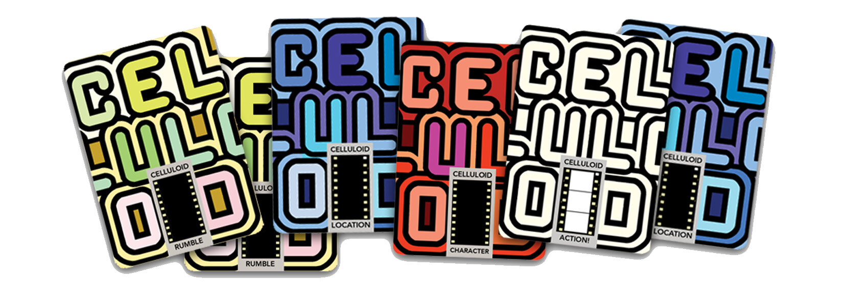
The style we were aiming for was friendly, colorful, illustrative and fun. Using the existing logo as inspiration and the fulcrum for all design decisions, Archival Black Regular typeface was selected for the headline for its boldness. The Monserrat typeface was used for the paragraphs to balance out the impactful headlines and lend a playful but yet authoritative sensibility to the information at hand.
Assigning primary and secondary color palettes allowed my client to switch colors for newness when sending out updates, while keeping a cohesive look with the website and game’s artwork.
Design Solution and Validation
New and Improved.
Reorganizing and relabeling the content allows users to navigate the site easily to find the information they are looking for.
Want to know the latest news? Check the Homepage! What are the rules of the game? How To Play will give some ideas. Can I play now? A link to Shop will be available when the product is ready to launch but hey, in the meantime sign up for updates.
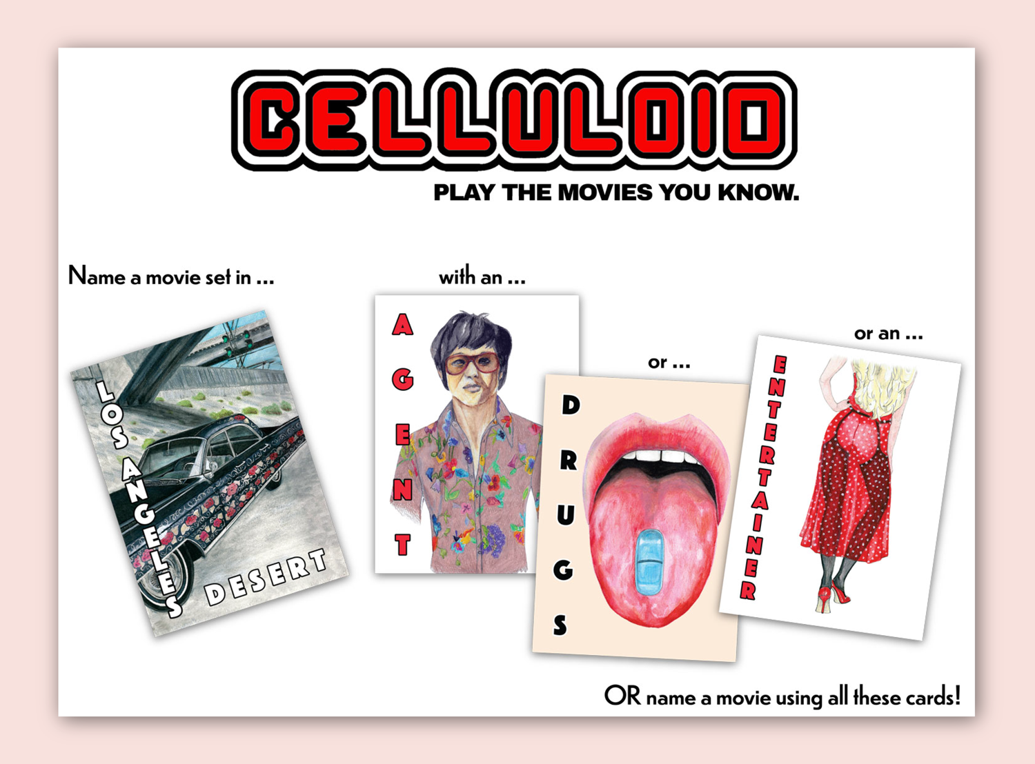
Visuals offer users a quick way to learn how to play Celluloid.
A Beginning of a Beautiful Friendship.
Storytelling can get people excited and emotionally invested in a product. Users are immediately immersed into the game as they navigate the Home page and are introduced to the creator and the game’s history in the About page.
Come Play With Us.
By giving users multiple opportunities and friendly reminders to sign up, a level of trust is built and they become more willing to join the Celluloid community.
The redesign at the time of this write up has seen an uptick of user sign up by 1.3%. I’m curious to see how the rate will change when the project officially launches coupled with other marketing strategies that would pull new visitors to the website.

Reflection
The goal of the website was to create an environment where users can feel like they’re already with a friend. By putting the creator’s story and art in the forefront while also advocating for the users, I was able to create an experience that was friendly and easy to navigate. Even though it was a challenge to balance the maximalist tendencies of my client with the need to keep the information as minimal as possible for the user, it was a fun project to create a digital space for the Celluloid community.
I am excited to see how the website and style file will evolve with the addition of videos, shop, user testimonials and user submissions when the game officially launches.

